Learn how to clean sex toys based on their materials to avoid dangerous chemical interactions, infections, and STDs. Explore myths about what makes a sex toy safe to use—a must-read for sex toy safety.
Learn tips on avoiding fear-based marketing and misinformation from uneducated or deceptive sources on the internet. Find out how to spot it and resources for unbiased information.
Flavored condoms, dental dams, and flavored lubricants are nothing new. What is new is the rise of oral experience enhancers, products designed to support taste perception, scent, and comfort in more targeted ways.
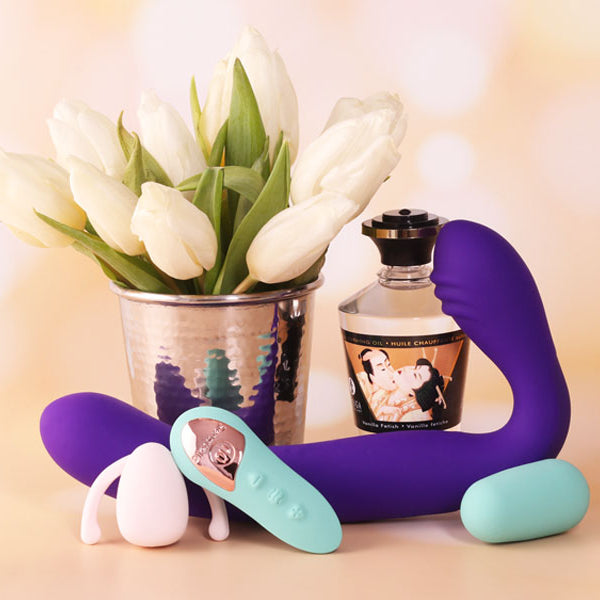
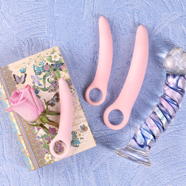
We-Vibe’s C-shaped vibrators are easy to mix up and expensive to guess wrong on. This guide breaks down what each model actually does, who it fits best, and which one makes sense for your body, your sex life, and your patience.
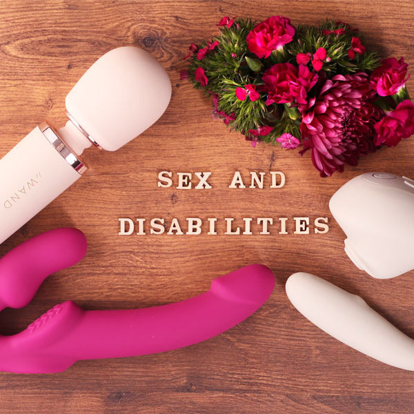
Learn how to use a body-safe vibrator to ensure that you get the maximum pleasure, and learn how they are more than just tools for pleasure. Dr. Lisa Lawless reveals how they uplift sexual health, support disabilities, and more. Dive deep into this enlightening guide!
Learn about different ways to stimulate nipples, various types of nipple toys, as well as how to use nipple vibrators, nipple clamps, and nipple suckers.
Think you know about toxins in sex toys? There is a lot of misinformation. Let us help you separate fact from fiction to tell if your sex toy is toxic.
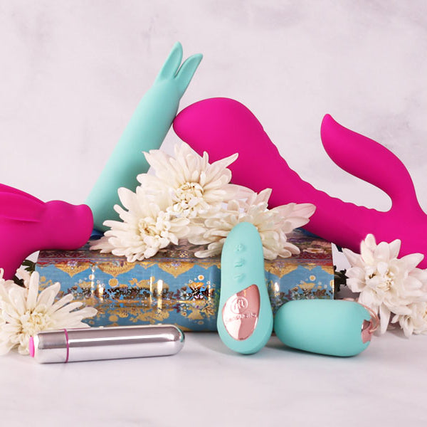
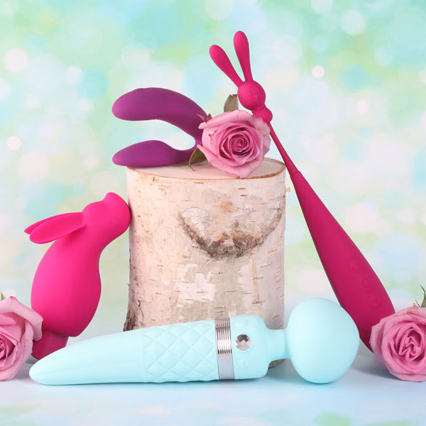
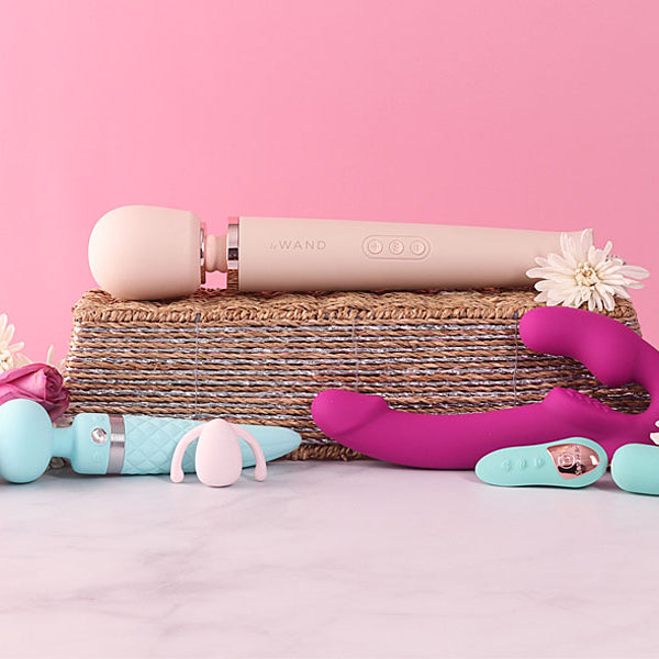
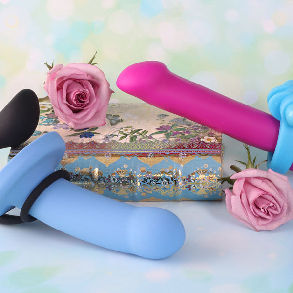
Learn about common vibrator myths and dive deep into their rich history. Discover how to choose the perfect one for you by learning how to choose wisely to be an empowered consumer.
Disabled people use sex toys for the same reasons as non-disabled people, for pleasure, sexual experimentation, and sexual health. Learn more about what is available.
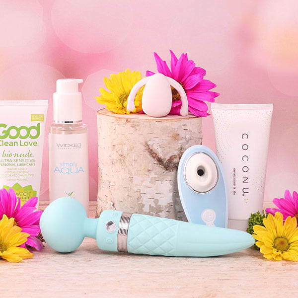
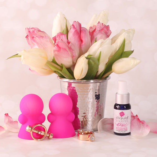
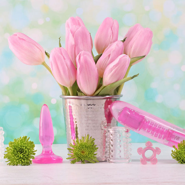
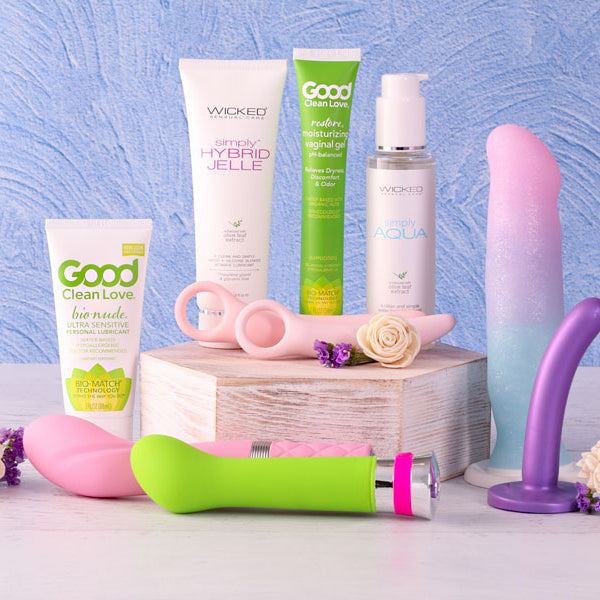
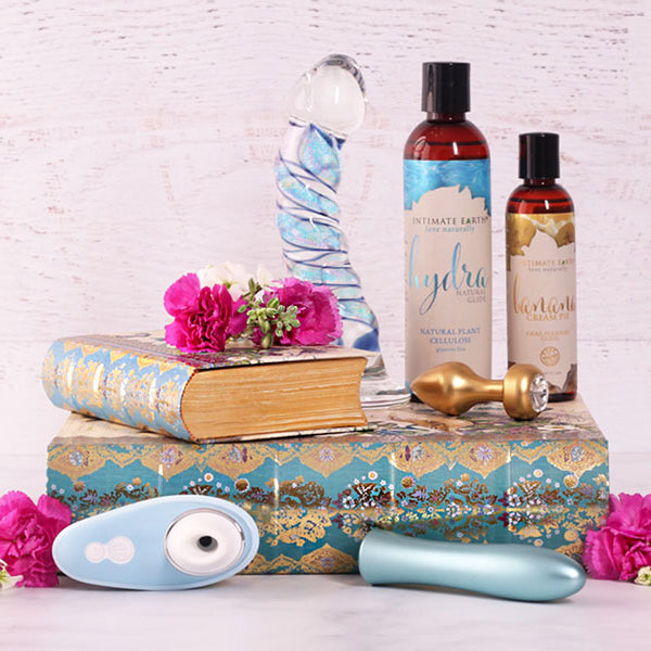
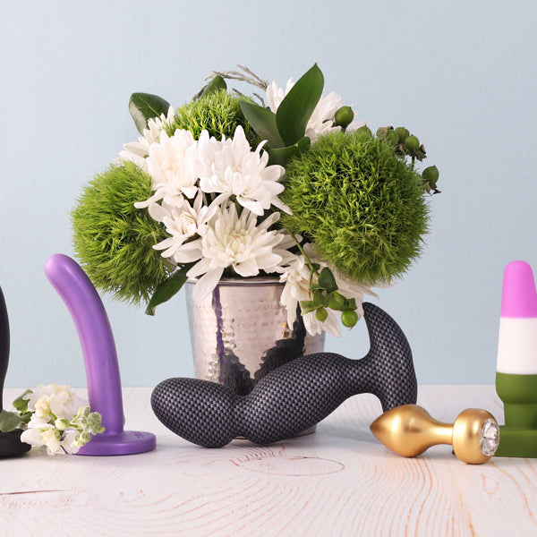
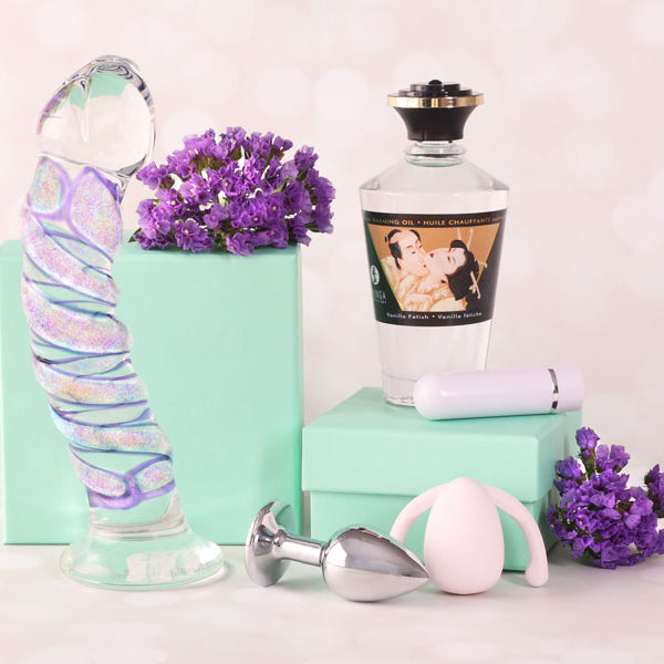
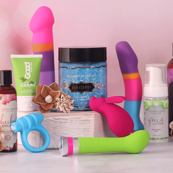
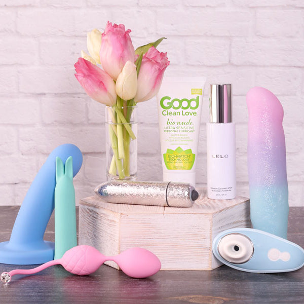
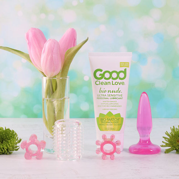
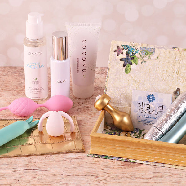
Explore the benefits of using sex toys, learn how they can enhance your sexual health and pleasure, and receive guidance on ensuring they are non-toxic and body-safe.
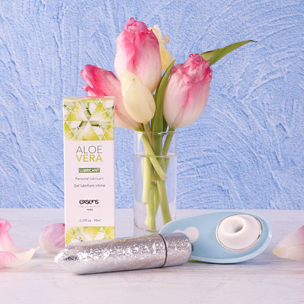
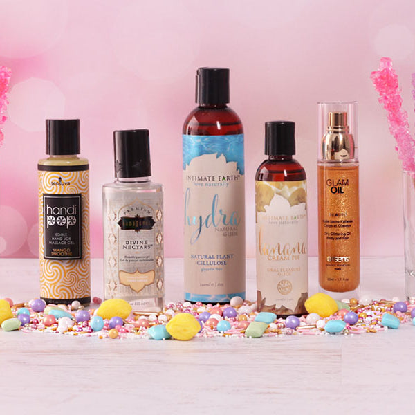
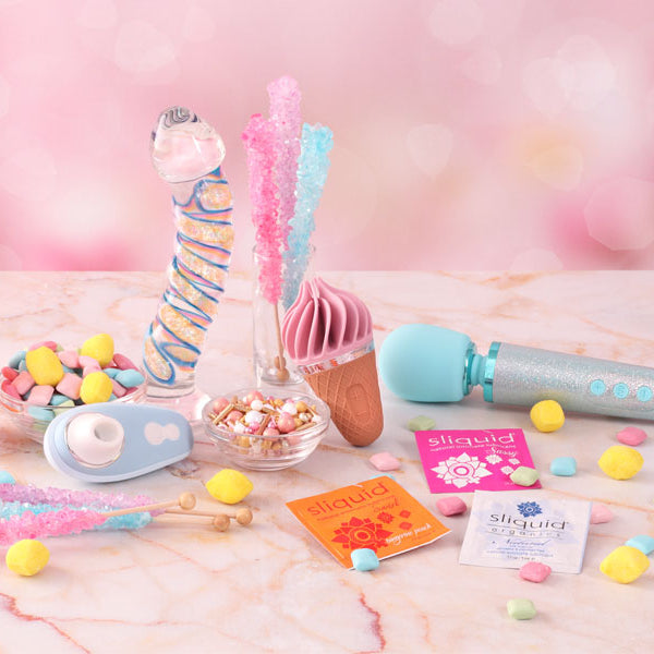
Flavored lubricants need to taste amazing and also be healthy for you to ingest and use for penetrative sex. Learn which brands offer the best flavored lubricants.
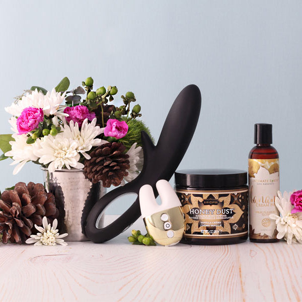
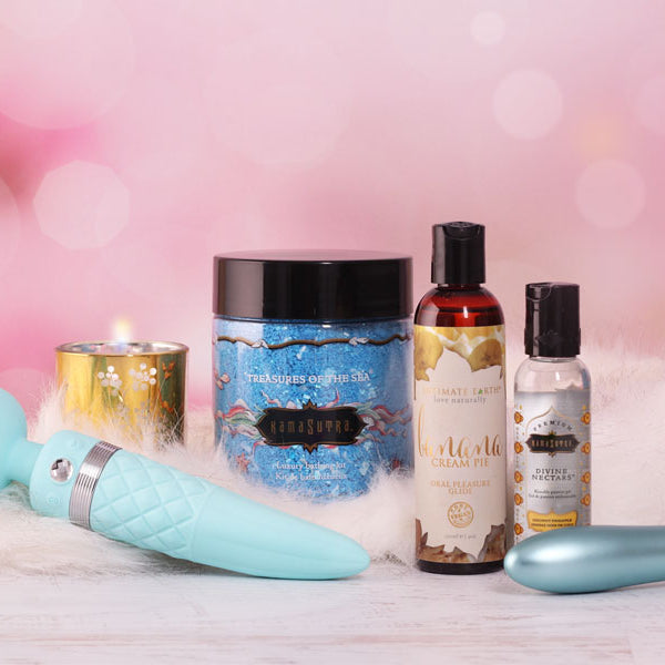
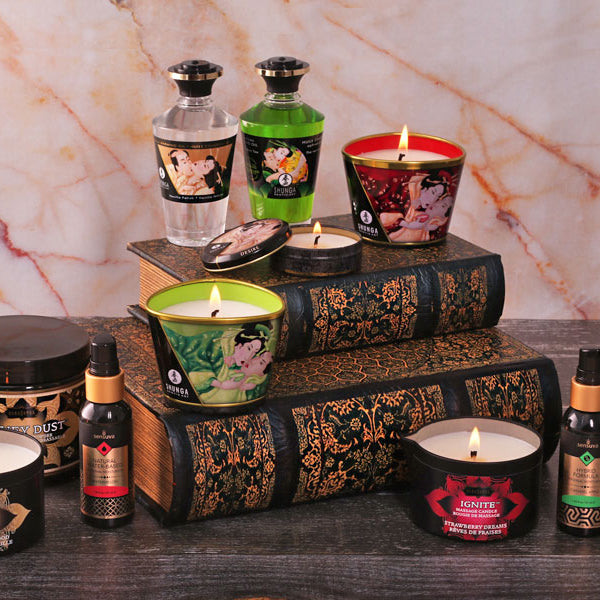
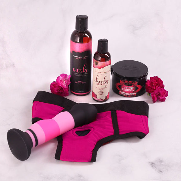
Learn about massage candles made of fragrant massage oils that can be poured onto the skin for a sensual massage and how to make sure they are paraffin-free and healthy.
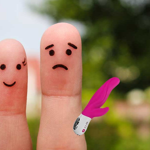
Explore the common fears surrounding sex toys, such as jealousy, insecurities, social stigma, and health concerns. Learn if sex toys are right for you and your partner and how to communicate about them.
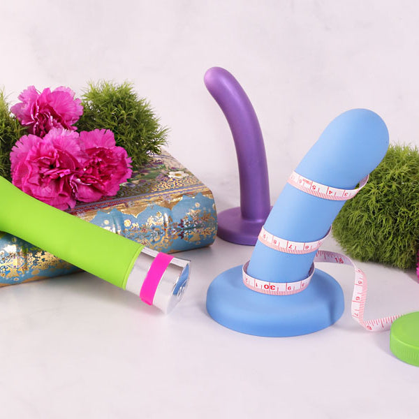
When it comes to quality, some manufacturers do it better. Learn what the best sex toy brands are and what to look for when choosing body-safe sex toys.
Paraben-free lubricants are all the rage, but some claim paraben paranoia and that parabens are safe to use. Learn more about the controversy of parabens in lubes.
Learn why having a healthy pH level is essential in lubricants as it can impact susceptibility to STDs, STIs, as well as impact your ability to become pregnant.
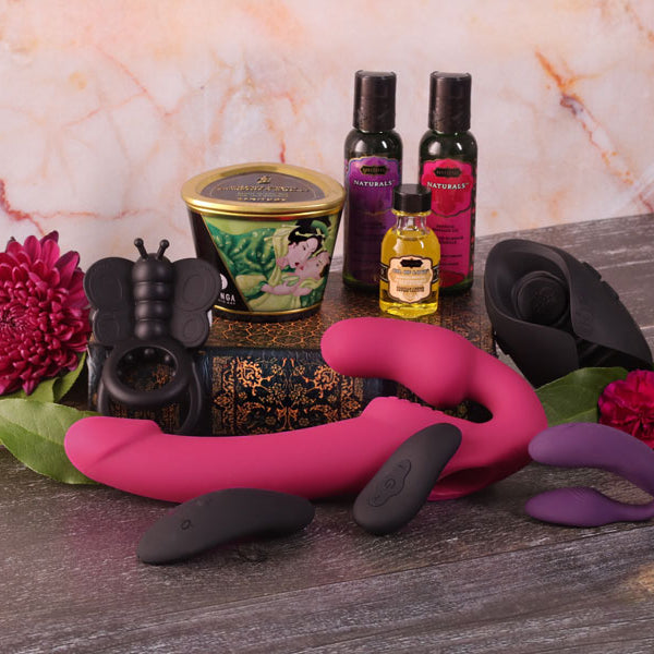
Get educated about the best sex toys for men, women, and couples, according to sex therapists, doctors, and relationship experts. Discover why they are so well regarded and what to look for when buying them.
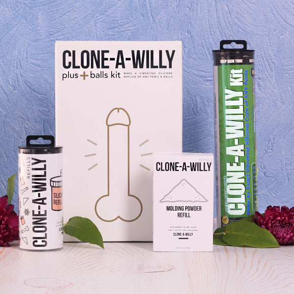
Everything you wanted to know about Clone A Willy Kits and Clone A Pussy Kits to make your own sex toys and replicate your penis or vulva. Special instructions and FAQs included.
Explore new sex toys and sexual products that are available for men who have erectile dysfunction (ED) such as unique hollow dildos, double-hole harnesses, and more.
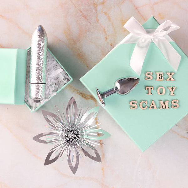
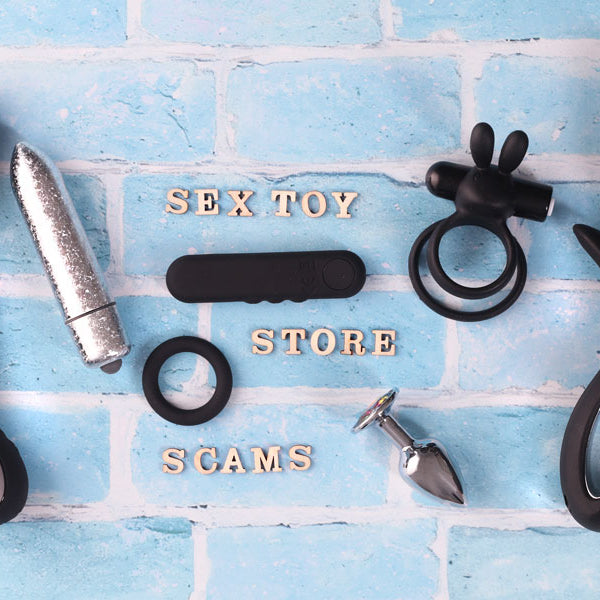
You look for authorized dealers when it comes to important purchases, so why would you not choose one when it comes to your sexual health. Learn why it is vital only to buy sex toys from authorized dealers.